Ideas
‘Excess’ Covid Deaths: A Primer For The Mathematically-Challenged
- ‘Excess deaths’ became a convenient shorthand that took a life of its own. Important qualifiers such as trend, registrations and attribution got omitted.
- Here’s a primer on India’s death registration system and the data it throws out.
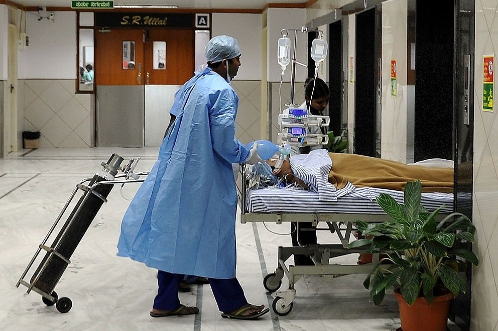
A hospital in Bengaluru. (Manjunath Kiran/AFP/Getty Images)
Excess deaths are in the news. Sensationally so.
“40x excess deaths in Undercount Pradesh”.
Any ginormous number headlined without context is meant to make us click, not think. But, the more fundamental problem isn’t the number. It’s the term itself.
Getting to a better number, especially for all of India, means starting with a better definition.
‘Excess deaths’ is misleading. Both words.
First, excess compared to what is ill defined. If it is compared to a prior trend, then that trend is rarely shown. Methodologies are copied from elsewhere without incorporating contextual differences. When large deviations from trend are the norm, distinguishing excess from noise is non-trivial.
Second, we can only count registrations, not deaths. The two are different, and trend differently. This has implications for estimation and extrapolation.
Excess deaths are not what we originally set out to find. It was “how many people died of Covid in India”.
In any country, this is surprisingly difficult to answer. It is extra hard in India, given systemic limitations. Answering this question requires an estimate of above-trend death registrations attributable to Covid.
Since this is a headline-writer’s nightmare, ‘excess deaths’ became a convenient shorthand that took a life of its own. Important qualifiers such as trend, registrations and attribution got omitted.
While a precise estimate of appropriately-attributed above-trend deaths is not possible, a better approach is. That’s what I’ll attempt, starting with this essay.
As I have discussed earlier, sound judgement starts with a frame of reference that is grounded in history. This addresses the ‘what’ in ‘excess compared to what’. So, here’s a primer on India’s death registration system and the data it throws out.
We Count Registrations, Not Deaths
In India, the Civil Registration System (CRS) captures death registrations. Pan-India CRS statistics were last published for 2019 (the report came out a few days back). Some 7.6 million deaths were registered in 2019, out of an estimated 8.3 million deaths.
Note that actual deaths are always an estimate, based on survey-based inputs, while registered deaths are a precise summation of local level records across India.
CRS-2019 estimates that 92 per cent of deaths were registered, up from 69 per cent in 2009. Registration percentage varies widely across states, from 52 per cent in Bihar to over 200 per cent in Delhi.
As implausible as 200 per cent suggests, CRS isn’t flawless. Delhi likely logs deaths pertaining to neighbouring states. CRS claims that the number of deaths (not registrations) in India peaked in 2013 and has since been declining.
However, many states with near-100 percent death registration in 2013 saw continued growth in registered deaths at above-average pace over 2013-19 (eg, Andhra Pradesh, Delhi, Gujarat, Haryana, Karnataka, Tamil Nadu). Go figure!
My limited take-away from CRS is to solely analyse registered-death data, without fussing about true death numbers or registration percentages. It is hard enough separating signal from noise with formally tabulated registrations.
It is futile to attempt the same using estimated parameters. In Western countries, this distinction is moot as systems have evolved to a near 1:1 match between deaths and registrations.
India’s Trend Growth Matters
Take a look at two charts:
India’s registered deaths (in red) show a consistent increasing trend, with a 3 per cent CAGR (compounded annual growth rate) over last three decades.
The UK (representative of Western countries) showed -0.2 per cent CAGR over the same period. Even during an increasing phase, the 10-year CAGR didn’t exceed 0.8 per cent.
Western methodology for calculating ‘excess deaths’ simply compares Covid-period deaths to prior years (typically 2015-19), without any trend adjustment. This makes sense when trend is zero-growth. This does not make sense when trend growth is 3 per cent.
As we’ll see in next section, many states show trend growth well above 4 per cent. Incorporating trend-adjustment eliminates 100 per cent of ‘excess deaths’ from many superficial analyses.
Variability Also Matters, And Complicates
Now for the trickier part. Pan-India registered deaths data is unavailable for Covid-impacted 2020 and 2021. So, we have to make do with whatever state-level data enterprising journalists have scraped from various sources.
This has to be framed against state-level historic data, which is way more messy than national aggregates. What follows is 10-year state-wise registration data from CRS-2018 and CRS-2019 (for top 19 states, accounting for 96 per cent of registered deaths). I show raw data, annual growth over entire period and year-wise growth rate in the next two tables.
Treat the first table as reference data for subsequent analysis. Let’s only discuss the second.
For a particularly volatile example, look at Bihar. Nine of 10 years show massive double-digit growth or decline in registered deaths. You would be forgiven for thinking that Covid hit Bihar in 2019.
How does one discern a Covid-uptick out of this erratic pattern (Did recent media report on Bihar excess-deaths even mention this relevant history)?
Fourteen our of 19 states had at least one outlier uptick.
India, as a whole, showed near-double-digit growth across 2018 and 2019.
In aggregate, 33 out of 182 data points (18 per cent of the time, shaded red) show double-digit growth over the previous year. That’s a lot of cleverly hidden pandemic years, long before the damn bug escaped its lab.
More seriously, this is an artefact of an evolving death registration system, not a tragedy every five to six years. But when a pandemic occurs, how do we separate the two?
Making Sense Of Covid-Period Deaths Requires Careful Framing Against Historical Context
Why assign so much space to a back story? Because, context and framing matter. Incremental information is meaningless unless appropriately viewed against a historical trend.
Expected/trend deaths for 2020 and 2021 is the baseline against which excess is measured. When trend is unclear or volatility is high, this baseline becomes fuzzy.
Above-trend deaths is a crude range, not one definite number. If this falls within historic range of fluctuations, we simply don’t know what to make of it.
There are other dimensions to be incorporated. Not all excess deaths are due to Covid, since other deaths are elevated due to healthcare deprivation.
Often, this is downplayed. Disingenuous references are made about road accidents being down (at 2 per cent of deaths, effect is marginal compared to over 80 per cent of deaths being impacted by crunched hospitals).
In Western countries, where better cause-of-death data is available, studies attribute of around 70 per cent of excess deaths to Covid, not 100 per cent. This is rarely incorporated into sensational ‘undercount factors’.
Similarly, internals of state-level data can hold relevant information. This could be district-wise or age-wise colour. Idiosyncratic factors help refine analysis or gauge data reliability.
In the second-wave, where timeframes are shorter, the lead time for registering deaths (CRS prescribes 21 days, but the reality is longer) is a factor in deciding choice of time-period to zoom in on.
In summary, it’s complicated. It’s not about click-n-drag. It’s not about a model spitting out a pan-India number. This requires careful, often subjective, incorporation of history into analyses, one state at a time.
Extrapolation from parts to whole requires caution and humility. Reliably estimating above-trend deaths is way harder than shallow ‘massive undercount’ stories imply.
On a related note, I have a simple rule that works in my day job. Good companies show history, comprehensively and transparently. Flip through the investor-relations website of a respectable business and you will find the last five years’ balance-sheet, cash flow and return on capital in big font in investor presentations.
Take a dodgy outfit and you will have to kidnap the promoter’s first-born child to get that information (though we do not recommend this).
Hiding relevant history is a red flag. It’s the same with good analysis. An analyst (even seemingly credentialled ones) who does not show relevant history, and fails to explain how it impacts conclusions, reveals more about himself than about the topic at hand.
Whither From Gither
This essay lays out the problem being attempted, relevant context and challenges. It hints at a more historically-grounded approach that can minimise flaws seen is typical ‘excess death’ stories.
The next step is to implement this approach, state by state, wave by wave, across all available death registration data. While I will attempt this, it will not be all at once.
I will start by analysing a few states in detail, to better illustrate the approach as well as to log specific problems that will become apparent only as we go deep (eg, data inconsistencies, confusing trends). Only examples can convey how messy this world is.
I may poke into a few cities/districts, where data gets even more volatile. Then, I will see what we can make of the first wave, if we aggregate all available regional analyses.
While second-wave data is still coming in, we can gingerly attempt a similar exercise in July. Somewhere along the way, I will also update my life insurer claims analysis, for independent triangulation.
I cannot guarantee reliability of results or how soon I will do all this. However, I can guarantee that I will show you as much historical data as is available in each case.
When I start from a media report on a particular state, I will only use its raw data, not someone else’s assumptions. I will be transparent about my own assumptions or subjective judgment calls. In each case, you should be able to separate data from my biases, so that you can make different inferences as required.
Unlike those confident folks, I doubt if I will reach a grand India-undercount estimate for many weeks. Maybe longer. But, that’s not the point of this exercise. This isn’t about an answer. It’s about a way of thinking.
About numeracy, history, complexity, uncertainty, imprecision. About humility in jumping to conclusions, when buggy humans analyse our messy world. Once you appreciate these, you’ll get to better answer than what’s out there, with or without me.
PS. As a hint of how this works, let’s close with a quick look at Bihar.
A recent article ran with sensational headline of 75,000 excess deaths over January-May 2021. While the article didn’t explicitly table month-wise numbers, it implied around 35,000 deaths/month over January-April and around 70,000 deaths in May.
CRS places Bihar’s monthly deaths at 30,000 in 2019 and trend growth at 10 per cent a year (we’ll use average and ignore variation, since this is a shallow-dive). This suggests that January-April 2021 deaths were in line with trend and Bihar saw around 35,000 above-trend deaths in May.
Incorporating relevant history has already cut excess deaths by 55 per cent. Say, we attribute roughly 70 per cent of above-trend deaths to Covid.
Against some 8,000 reported Covid deaths (including retrospectively added 4,000), this equates to a 3x undercount in a state with India’s weakest death registration system. (Any second-wave analysis has to be qualified with: disease, death registrations, Covid death reporting are all ongoing, making inferences conditional on incoming data).
Whether you agree with my assumptions or trend calculation is the less important part. The more important one is that you have a decade of history, against which you can make your own informed inference about 2021 Covid reporting in Bihar.
That’s a step up from just seeing a 75,000 or 10x headline, or worse, a sensationalist pan-India extrapolation from a flawed starting point.
Anand Sridharan is an investment professional. Views are personal. This article was originally published here. Reprinted with permission from the author.
Introducing ElectionsHQ + 50 Ground Reports Project
The 2024 elections might seem easy to guess, but there are some important questions that shouldn't be missed.
Do freebies still sway voters? Do people prioritise infrastructure when voting? How will Punjab vote?
The answers to these questions provide great insights into where we, as a country, are headed in the years to come.
Swarajya is starting a project with an aim to do 50 solid ground stories and a smart commentary service on WhatsApp, a one-of-a-kind. We'd love your support during this election season.
Click below to contribute.
Latest