Lite
Not Really: Three Charts to Show How Bad Modi’s Economic Policies Are
This weekend, junk the old-school methods of analysing economic policies. Here is a new, much simpler way of doing that.
2015 was revolutionary. At least for me. Rarely has there been an year in my life as educative. I have learned how astonishingly naive an outlook I had towards commenting on the issues of economics, public policy and politics. Words won’t suffice in expressing my gratitude towards various websites that have shaped my new-found understanding. At the end of last year, I threw away all my statistics, econometrics, mathematics, macroeconomics and philosophy books. Now, you might be wondering why not give it to someone for free? Well, considering how useless those books were I wouldn’t want anyone to waste their time on any of that. Nuance is overrated. Analysis is hokum. Actually I am surprised that this newly acquired skill of mine isn’t being offered on the “Afternoon-Tele-Shopping” programs for within hours it can turn one into a professional “policy-analyst-journalist-economist-philosopher-data-wonk”.
The skill I have learned is “research-through-charts”. Yes, gone are the days of spending days working on a small little piece to ensure sound analysis. Now the charts do it for you. In fact, the charts are so illuminative that when I looked at Modi’s policies through charts I have realized what a disaster his economic policies have been. I take this opportunity to share my findings with you for the benefit of those who also wish to be “serious analysts” like me.
Let’s get started then.
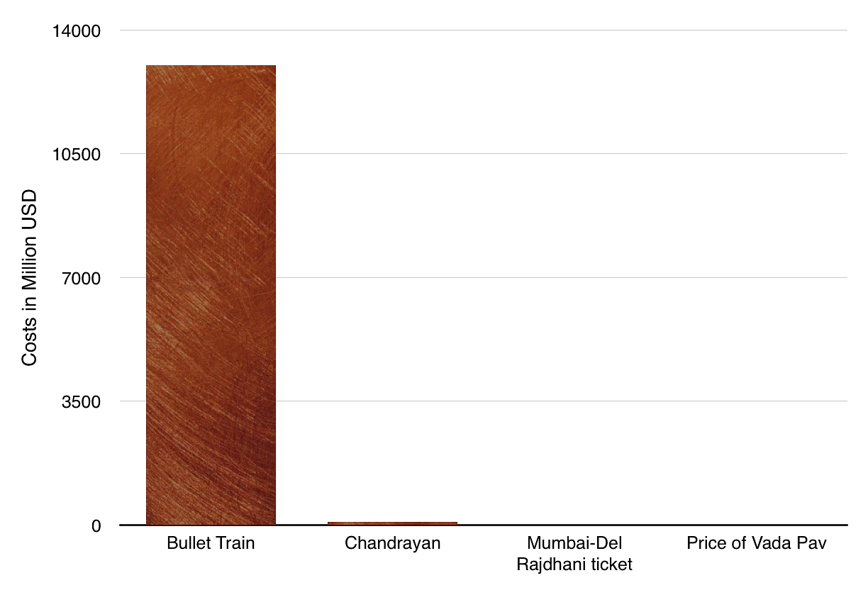
Mumbai-Ahmedabad Bullet Train
The first policy which helped me realize Modi’s failure was his flaunted project of Mumbai-Ahmedabad bullet train. See for yourself, from this chart, how expensive this bullet train is.
Ridiculous, isn’t it? One bullet train is some 2000 Chandrayans, 250 million Rajdhani trips between Mumbai-Delhi and some 10 billion Vada-Pavs. That is, one bullet train could feed 10 billion vada-pavs. Given India’s performance on nutrition, should we not prioritize Vada-Pav over bullet train? Now, there maybe some overzealous nitpickers who will point out that Chandrayaan was a one-time expenditure while bullet train is a capital expenditure to be incurred over many years, or that most of that expenditure is financed as a near-zero interest loan by the Japanese govt, or that Vada-Pav isn’t exactly comparable with bullet train. But this isn’t a time to talk about such non-sensical criticisms. This is the time to bask in the glory of chart-induced understanding.
Truth should never come in the way of an interesting chart. Remember this and you shall do very well!
Jan-Dhan Deposits
The Modi government has touted the Jan-Dhan Yojana for a while now. We are being told that many poor have opened bank accounts and have also deposited money in them. Apparently, this financial inclusion will see benefits in the long run. But how big are the deposits? Just take a look at this chart!
This is how insignificant the Jan-Dhan deposits are in comparison with Pakistan’s GDP. Anyone wondering about what Pakistan’s GDP has to do with India’s financial inclusion programme clearly lacks the perspective on the global international relations that will shape the future of politics and economics in South Asia. Once one looks at the changing environment through this perspective, the relationship would be clear. And if it isn’t, worry not. It will make you look like saying something profound.
GDP Growth Rate
Last, but not the least. This is a government that has spoken about growth and development since time immemorial. So how does the GDP growth rate look like? Again, the panacea for all issues. The chart.
This is probably one chart that you must look at to understand how we’re doing under Modi. And of course, the test of your understanding and proficiency is to explain to me, in comments, the relation between each of the things on the chart. Do that and I guarantee you that you aren’t very far from being a troll columnist. But make sure that the charts have the right colors and design. Analysis isn’t what’s needed to be an analyst.
Introducing ElectionsHQ + 50 Ground Reports Project
The 2024 elections might seem easy to guess, but there are some important questions that shouldn't be missed.
Do freebies still sway voters? Do people prioritise infrastructure when voting? How will Punjab vote?
The answers to these questions provide great insights into where we, as a country, are headed in the years to come.
Swarajya is starting a project with an aim to do 50 solid ground stories and a smart commentary service on WhatsApp, a one-of-a-kind. We'd love your support during this election season.
Click below to contribute.
Latest