Politics
UP ‘Excess Covid’ Deaths: Cherry-Picking Data Gives Us Distorted Picture
- Despite having complete data, the report makes no mention of how all of UP fared.
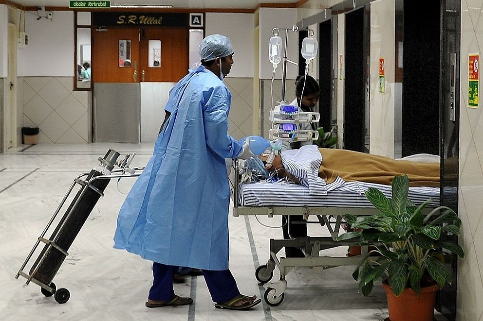
A Covid hospital. (Manjunath Kiran/AFP/Getty Images)
A recent report collected mortality data for Uttar Pradesh through the Right to Information Act (RTI), an admirable step in the direction of transparency. But the chosen time periods were odd (July 2019 to March 2020 and July 2020 to March 2021), not merely because they were nine months each, but due to lockdown distortions.
The former period death registrations were depressed due to a lockdown in the last 10 days of March. The latter period death registrations were inflated since unlock started in June 2020 with the backlog still getting cleared in July 2020.
The periods don’t fully overlap with the first wave, second wave, calendar year or fiscal year.
Ignoring such quirks, had the analysis simply shared all the data and inferences from the same, it would have added to our collective understanding of how Uttar Pradesh handled Covid.
Unfortunately, instead of sharing inferences from all data, the analysis only uses some data. The report limited its findings to 24 cherry-picked districts (out of 75). A sensational 110 per cent growth in deaths (197,000 ‘excess deaths’) was reported between periods. This misleading highlight was widely reported.
To show you how meaningless such cherry-picking is, let us look at an identical analysis on Civil Registration Service (CRS) data from 2017-2019, where we cherry-pick 24 districts with highest growth in deaths.
You can see that cherry-picked growth is alarmingly large, some 6-15x higher than overall growth, long before Covid. Given inherent variations across districts in any year, more so in states with weaker registration systems, this to be expected.
The 110 per cent highlighted in report reveals more about the analytical methods used than about UP’s death trends. As indirect confirmation of this effect, the report notes that 20 other districts showed negative growth (-2 per cent to -48 per cent), but doesn’t include these 20 in any analysis.
Headlined numbers are unhelpful as a guide to how UP fared, as state-level growth can easily be over 90 per cent lower than what’s shown for 24 districts.
(Similarly, in a recent Odisha example, going from 24 chosen districts to all 30 districts, reduced the excess deaths estimate by 50 per cent. Here, the author did the right thing by sharing trends for both the part and the whole.)
But there’s more. I mentioned that the lockdown likely depressed deaths during the July 2019 to March 2020, especially the last few days of March 2020. This period’s monthly deaths are 28 per cent lower than 2018 and 21 per cent lower than 2019. You can see below how the reference period used in study is way below 2018 and 2019.
The ‘excess’ death figure falls by 36 per cent just by switching comparison period to 2018.
With multiple effects combining to severely inflate results, what does this analysis tell us about UP’s excess deaths? Nothing at all. Except that it is way lower than the headlined figure in this cherry-picked analysis using distorted reference periods. It is telling that, despite having complete data, the report makes no mention whatsoever of how all of UP fared.
Extracting systemic data that betters our understanding of a crucial issue is commendable public service.
However, an analyst’s role doesn’t end there. Not sharing this data transparently runs counter to the original objective. Exclusively selecting outlier data points from one end of the distribution makes it worse. While assumptions can be subjective in any analysis, input data cannot be so.
After having written above critique of cherry-picking data, I found UP’s all cause mortality data.
This is summarised by the author into following chart.
As is evident, UP’s death registrations grew mid-single-digit in 2020 versus 110 per cent showcased for 24 chosen districts.
In fact, according to CRS-2019, UP’s average monthly deaths were 79,000 per month, implying that red line should be drawn higher on the picture.
However, this is likely to be due to inconsistencies between sourced data and CRS-2019, not a deliberate error.
Clearly, lockdown depressed death registrations over March-May. However, a part of these may have been updated after lockdown ended, making it impossible to separate out this effect.
Support Swarajya's 50 Ground Reports Project & Sponsor A Story
Every general election Swarajya does a 50 ground reports project.
Aimed only at serious readers and those who appreciate the nuances of political undercurrents, the project provides a sense of India's electoral landscape. As you know, these reports are produced after considerable investment of travel, time and effort on the ground.
This time too we've kicked off the project in style and have covered over 30 constituencies already. If you're someone who appreciates such work and have enjoyed our coverage please consider sponsoring a ground report for just Rs 2999 to Rs 19,999 - it goes a long way in helping us produce more quality reportage.
You can also back this project by becoming a subscriber for as little as Rs 999 - so do click on this links and choose a plan that suits you and back us.
Click below to contribute.
Latest