8 Charts To Understand India’s Poor Agriculture Productivity

8 Charts To Understand India’s Poor Agriculture Productivity

by Swarajya Staff - May 11, 2016 09:56 AM +05:30 IST
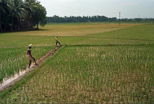
8 Charts To Understand India’s Poor Agriculture ProductivityIrrigation/Getty Images
Snapshot
  • Eight charts will help you better understand Agriculture in India.

#1 Distribution Of Gross Cropped Area Across Major Crops

#2 Distribution Of Gross Cropped Area Across Major Cereals

#3 Area Under Foodgrain Production

#4 Foodgrain Yield Per Hectare Across India

#5 Rice Yield Per Hectare Across The World

#6 Wheat Yield Per Hectare Across The World

#7 Potato Yield Per Hectare Across The World

#8 Banana Yield Per Hectare Across The World

Data From Niti Ayog

Get Swarajya in your inbox everyday. Subscribe here.

An Appeal...

Dear Reader,

As you are no doubt aware, Swarajya is a media product that is directly dependent on support from its readers in the form of subscriptions. We do not have the muscle and backing of a large media conglomerate nor are we playing for the large advertisement sweep-stake.

Our business model is you and your subscription. And in challenging times like these, we need your support now more than ever.

We deliver over 10 - 15 high quality articles with expert insights and views. From 7AM in the morning to 10PM late night we operate to ensure you, the reader, get to see what is just right.

Becoming a Patron or a subscriber for as little as Rs 1200/year is the best way you can support our efforts.

Become A Patron
Become A Subscriber
Comments ↓
Get Swarajya in your inbox everyday. Subscribe here.
Advertisement

Latest Articles

    Artboard 4Created with Sketch.