Ideas
Coronavirus: Why The Focus Should Be On Trends, Not On Numbers; And Why There Is No Spike And Community Transfer
Venu Gopal Narayanan
Mar 29, 2020, 02:30 PM | Updated 02:29 PM IST
Save & read from anywhere!
Bookmark stories for easy access on any device or the Swarajya app.


On 28 March 2020, India reported its highest number of Wuhan Virus cases in a single day, since the pestilence landed on Indian shores; the numbers jumped by 179, from 694 to 873.
Almost immediately, everyone and their ten best friends went into collective coma, social media spontaneously combusted under the weight of alarmed posts, and a cabal of media outlets was quick to declare that the end was nigh. It was a surge! It was a spike! It was Stage 3! Here at last was the proof which dubious, apocalyptic studies had been predicting for a week.
Indeed, your columnist had to spend a good hour, after a hearty breakfast of Quinoa Upma, calming agitated family members and friends down with the truth.
But, what is the truth? Simply put:
- The truth is that there is no spike
- There is no surge
- The Union government is right when it says that we are not into Stage 3 of the epidemic (community transmission)
- Society would be better served if analysts focused on trends instead of numbers
- And most importantly: analysing numbers is a science which should only be done by experts
Let us, therefore, address each of these conclusions in a question-answer format, so that the business of analysing epidemic data is better understood.
Q: What’s happening?
A: There has been an increase in the number of daily cases reported.
Q: Is it a surge or a spike? Are we doomed?
A: Neither. Also, by definition, a surge or a spike is a brief event, causing a radical break in an established trend. It only means a short-lived rise in numbers.
Now, since we have no proof of such a drastic distortion of trends, there is no surge, no spike, and no, we are not doomed.
Q: Prove it.
A: Sure. Take a look at this semi-log plot of cumulative cases versus time. Note: Semi-log means that the vertical Y-axis is on a non-uniform, logarithmic scale. We use it to compress data points so that trends may be identified with greater clarity.
Plot 1: India epidemic data, trends and forecasts
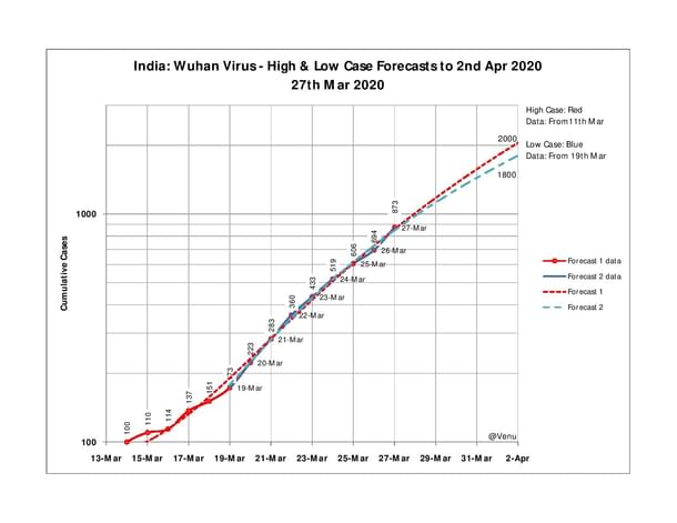
This is a plot of cumulative cases in India versus date, from 14 to 27 March. As you can see, the forecasts are slightly different depending upon the range of data selected. So, the red dotted line is a trend fitted on the entire data set. But the Blue dotted line is a trend forecast only for data from 19 March onwards (because patterns changed).
However, what we see is that there is very little difference in forecasts, even when the curve-fit of the red line is visibly off in the early part. Thus, on 2 April, we have a red forecast of 2,000 cases, and a blue forecast of 1,800 cases. Fairly close.
Now, let’s test the robustness of our predictions:
Plot 2: Forecast Sensitivity Test
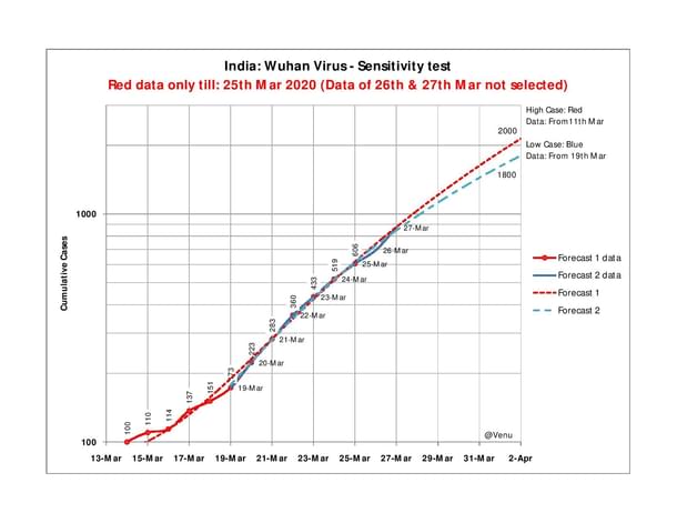
In Plot 2, we have removed the data of daily case numbers for 26 and 27 March (when the numbers started increasing) from the red line. The blue line remains unchanged as a control. As can be seen, there is no material change in the red forecast. That brings us to two important conclusions:
One, that the trend selection is proper, because, even without the data of 26 and 27 March, we still get red forecasts of near 700 and 900 on both those dates. The actual figures are 694 and 873 respectively.
Two, that if the actual numbers are demonstrably following a predetermined trend, then the ‘sudden’ jump of 179 on 27 March cannot be classified as a spike (or a surge).
This is the power of sensitivity analysis.
Now, just to be on the safe side, let’s get obsessive-compulsive about accuracy, and run a ‘spike’ test on the Indian Wuhan virus data:
Plot 3: ‘Spike’ test
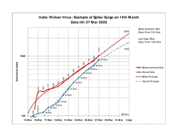
Let us assume that a spike happened on 15 March, that instead of the actual 110 cases, 250 were reported that day. What happens to the red forecast line? To our very genuine surprise, we see that the forecast doesn’t change dramatically.
So yes, 2,200 is a bit more than the actual red line projection of 2,000, but it is well within acceptable margins of error.
The inference is important: even if there is a spike, it is only that – a brief, abrupt rise in values which is short-lived, with the effect of the spike getting quickly absorbed by the more influential, actual trend.
Thus, we see that the rise of numbers of 27 March, although large, cannot be classified as a spike; and, that even if there was a spike, it would not materially impact the larger outcome.
Q: So, can you forecast the number of Wuhan virus cases in India by end of April, or May, by this method?
A: No, not advisable, and before you ask ‘why not?’, let me explain:
These are empirical plots. The trends represent an average of the values through which each line passes. Normally, they don’t hold good for much longer than the duration of the historical data upon which lines are drawn; meaning, if you have seven days’ data forming a definite trend, it probably makes sense to have highest confidence levels only on predictions for the next week. Anything further than a week, and the worth of your forecast begins to reduce. That’s why it’s more meaningful to use short-term forecasts, while focussing on trends instead of numbers.
Q: Why do you say that? Why would you rely more on a trend than on a number?
A: Easy. It is the trend which determines your conclusions and not a number. Let me show you why:
Plot 4: Daily cases vs Cumulative cases plot
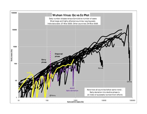
This is a log-log plot of daily cases on the vertical Y-axis, versus cumulative cases on the horizontal X-axis. The ugly, squiggly lines each represent individual countries, and the data of most of the largest, highly-affected countries are on this plot.
Very interestingly, it is seen that the epidemics in each country follow a broad common trend. First is an entry phase, marked by much data scatter (a function of identification and reporting as well). This is followed by the dispersal phase where the trend narrows and becomes more linear – irrespective of whether it is stage two or three. And finally, as containment protocols succeed, there is an exit into a decline phase, accompanied by a dip in the number of cases reported daily.
India is the bright yellow line, and as we see, the data of 27 March has caused an unfortunate uptick of a trend that had been cutting across the global trend – meaning, that the situation is under control. For comparison, look at the purple Japan line just below India, which too, is following the same, thankfully contrarian trend, albeit with the periodic uptick. Look further to the right and see how Korea – the success story thus far – too endured a few ups and downs before exiting into the decline phase.
Also, regarding India, don’t forget that these reported cases are of individuals who were already under monitoring. So, it would be wrong to believe that the appearance of more cases on the 27th marks a further spread of the Wuhan virus. On the contrary, as focused testing, containment protocols and a nation-wide lockdown continue to be enforced, the rate of spread is being brought down, and the India trend will mirror the Japan trend as it slowly and steadily makes its towards the decline phase.
Plot 4 is the strongest indicator that the government is right, when it says that we are not into stage three. Now, even if there is a spike, god forbid, it would be from the local infections, and not – repeat not – from community infections. This is the most important conclusion which may be drawn from the available data.
Q: Then what about those foreign studies predicting many crores of cases soon?
A: They employ the simulation technique – a complicated mathematical modeling process with severe limitations. It is their egregious misapplication in a cavalier manner, which has led to such outlandish, unrepresentative forecasts. Swarajya has already addressed the technical inadvisability of simulation in an earlier article here.
Q: Bottom line, then?
A: Don’t be alarmed, don’t fall for rumours, and follow containment protocols diligently. There’s no spike, and we’re not in Stage Three of the epidemic.
(All data from MoHFW (GOI) and WHO)
Venu Gopal Narayanan is an independent upstream petroleum consultant who focuses on energy, geopolitics, current affairs and electoral arithmetic. He tweets at @ideorogue.


