Politics
Data Story: Did The 'Farmers' Protest' Cause The Second Wave Of Covid-19 In India?
Venu Gopal Narayanan
May 11, 2021, 10:28 PM | Updated 10:28 PM IST
Save & read from anywhere!
Bookmark stories for easy access on any device or the Swarajya app.
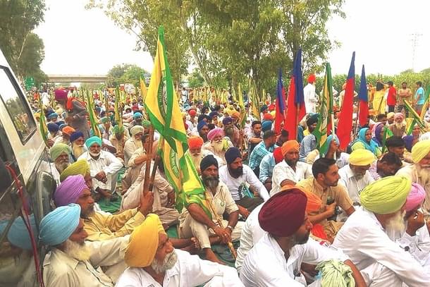

As India finally reemerges from a devastating second wave of the Wuhan virus, it is time to dispassionately understand how and why matters came to such a pass.
This is an important, and vitally necessary, exercise to undertake, because, unless and until the causes of the second wave are precisely determined, we leave ourselves open to the baleful eventuality, that such devastation could happen again.
These avenues of inquiry, then, condense upon a solitary, primordial question: Where and when did the second wave begin?
Popular perception and conventional wisdom would have us believe that the second wave began in mid-February 2021, in Maharashtra. From there, it spread to the rest of the country in a matter of weeks, engulfed our populace with resurgent virulence, and left a billion-plus people battered and mauled beyond recognition.
But that is not true; in reality, data analysis shows that the second wave began in the Punjab in early January 2021, in step with the so-called farmers’ agitation which had its epicenter there, and on the back of a new, even-more-lethal, UK-variant of the Wuhan virus.
This turns the popular narrative on its head, and instead, concludes that the second wave has its origins in the farmers’ protests – exactly as was feared at the time – a full month before fresh, lethal clusters began to ravage Mumbai and Pune.
It also charts a chronological path through the Punjab, Haryana, onto Delhi, and a second surge exactly a fortnight after the Republic Day mayhem at the Red Fort, which resulted in the UK variant now accounting for the bulk of the cases in that region.
How and why this data, available in the public domain for months now, was overlooked, also forms a subset of our investigations.
Here is the proof:
Our story actually begins in late 2020, and a regional second wave which hit northern India between October and December, in tandem with the farmers’ protests.
As Chart 1 below shows, this regional wave doesn’t manifest itself vividly at a country level curve (red, India line), save for a minor, transitory bump-up in November 2020.
But this localised second wave does manifest itself when we separately plot those areas which were struck by it – Chandigarh, the Punjab, Haryana, Delhi and Uttar Pradesh.
This is termed as the ‘First Protest Wave’. Again, its peak is not prominent in Uttar Pradesh (blue line) since the impact was restricted to a few districts of western UP close to Delhi; but the UP curve does flat-line with a minor rise, instead of continuing on its decline as it had since mid-September 2020.
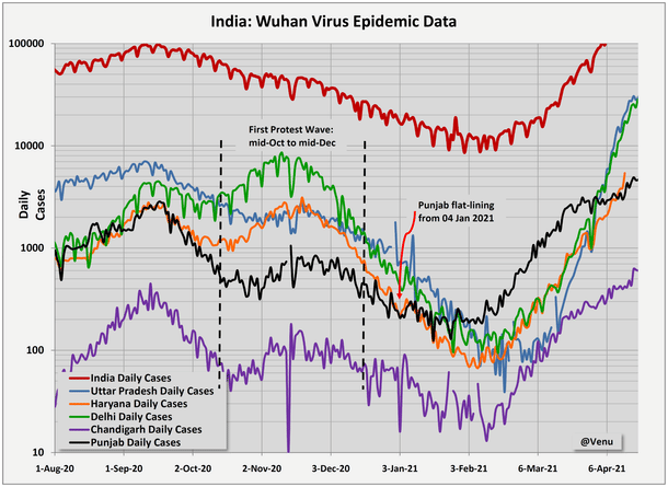
This trend shift, from a steady decline into a flat-line is our first marker, which we shall observe on multiple occasions in due course. Nonetheless, and politics notwithstanding, the States and Union authorities managed to stem the first protest wave, and uniformly enforce a decline which persisted till the second wave rose in early February 2021.
However, the epidemic data of the Punjab did not conform to this regional pattern.
As we can see from Chart 1 above, the declining trend of the Punjab curve (the black line) comes to a stop in the first week of January 2021, from when on, it flat-lines for a full month around the 200 cases/day mark until the first week of February, after which it starts to rise again.
To investigate this anomalous behaviour, the Punjab data was plotted separately, adding testing and positivity values, and is presented as Chart 2 below:

A series of inter-related inconsistencies were observed here:
First, a clear rise in cases is noted briefly in the first ten days of January 2021.
Second, testing in the state of Punjab is noted to decline consistently from early December 2020 to early February 2021; a possible giveaway is a marginal rise in testing for a brief while in early to mid-January 2021, contemporaneous with the rise in cases.
Third, the state’s death rates cease to decline in the first week of January, and flat-line around the 10 deaths/day mark for the next month; there is downward scatter, possibly indicative of under-reporting.
Fourth, coeval with the flat-lining of daily cases (brown line) is a flat-lining of the TPR (green curve in Chart 2 above).
Now, to improve confidence levels, and to validate observations, moving average trend-lines were generated for daily tests, daily cases, and for the TPR curves. Without exception, it is seen that all such trend-lines corroborate observations made on raw data.
Thus, the inference from all three observations is that prevailing decline trends ceased for all three parameters – deaths, cases and TPR – at the same time in the Punjab, following which, all three parameters started to flat-line, with sporadic upward spikes.
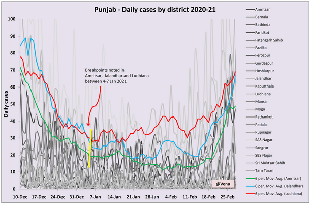
The next step of the workflow was to plot the Punjab data by districts, so that these multiple anomalies could be scrutinised more thoroughly, at a more local level. This is presented as Chart 3 below:
The first observation on this district level data is the high degree of scatter.
The second observation is that distinct trends do in fact emerge when moving averages are applied to individual datasets.
The third, key, observation is that three specific districts – Amritsar, Ludhiana and Jalandhar – exhibit clear trend breaks, and deviations from prevailing declines. These are marked by a yellow band in Chart 3 above.
In all three cases, the daily case rates flat-line in the first week of January 2021.
A fourth, equally important observation is that the rate of decline of daily cases actually reduces visibly in the last week of December 2020, prior to the commencement of such flat-lining (thereby further corroborating inferences).
Specifically, Amritsar started flat-lining on 4 January, Ludhiana on 6 January, and Jalandhar on 7 January.
Pertinently, Ludhiana (the red line in Chart 3 above) actually starts to exhibit a distinct rising trend of cases from 8 January. This rising trend identified in Ludhiana continues to rise consistently through January, and eventually starts to soar in the first half of February 2021, when the second wave finally catches on fully.
Equally pertinently, such a rising trend in daily cases is seen in Amritsar and Jalandhar as well, in the same time period as Ludhiana, although, declining testing levels mask these two trends after the middle of January, for a few weeks.
The initial flat-lining of cases in these districts, followed by their rise as early as the first half of January, were hitherto overlooked by most analysts, probably because the data scatter caused by reduced testing was too great; they became apparent only when trend-lines were generated on the raw data.
Next, having established that three districts in the Punjab had reversed declining trends in the first week of January 2021, the data of adjoining regions were studied to see if such break-points could be picked up there.
If so identified, the element of geographical contiguity would supplement our observation that this phenomenon was a broader, regional one, mirroring the farmers’ protests.
The first was Haryana, which neighbours the Punjab, and lies on the road to Delhi. The district level data of Haryana was plotted in Chart 4 below:
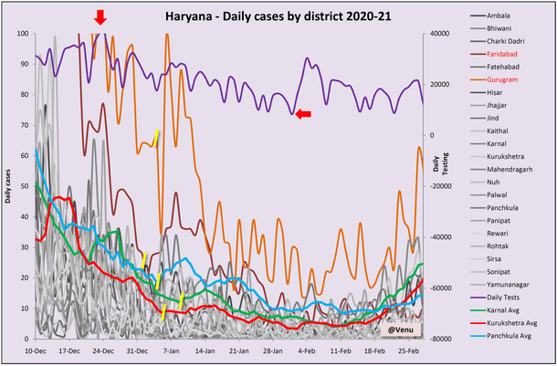
Very interestingly, the same trend break-points noticed in three districts of the Punjab are noticed in multiple districts of Haryana too.
In Panchkula, which is a suburb of Chandigarh, the daily case count actually records a sharp rise on 5 January.
There is a similar, distinct, sharp spike in Gurugram starting from 6 January (orange curve).
Cases in Faridabad start to rise steadily from 3 January (brown curve), but the trend is not sustained beyond 15 January, 12 days later.
A shift from a prevailing decline trend into flat-lining is also noted in the two districts of Karnal and Kurukshetra. All of these places lie on the road from the Punjab to Delhi.
In Haryana too, significant data scatter is seen, and like in the Punjab, this is attributed to a decline in testing levels.
Indeed, in Haryana, testing levels dropped critically by 75 per cent - from over 40,000 on 25 December 2020 to around 8,000 on 1 February 2021 (period marked by red arrows in Chart 4 above).
This fall has masked the true picture to a large extent, save for the average trend-lines in three districts, and the distinct spikes in Gurugram and Faridabad.
A third jurisdiction in the region is the union territory of Chandigarh. Its data is given in Chart 5 below:
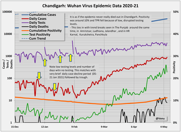
At this point, we see a brief decline in cases between 5 and 21 January, but that is in fact because of multiple days of zero testing, interspersed with days of low testing levels.
Together, they caused the TPR to drop mathematically, but tellingly, the cumulative positivity stayed around 10 percent.
This means that the period between early and late January was actually a false trough, caused by grossly insufficient levels of testing; and, that the falsity of the trough is underscored by the brief flat-lining which followed, before cases began to rise.
The summum bonum of this analysis is seen in the Delhi data chart below, in which it is clearly evident that the declining trend of daily cases ended abruptly on 27 January (marked by a yellow arrow).
A clear spike was reported the next day (and two days after protesters caused mayhem in the capital on Republic Day), following which, the trend flat-lined before rising in February with the second wave.
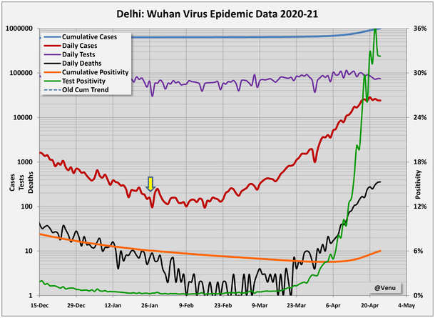
Thus, three central premises may be drawn from the data surveyed:
One, the second wave didn’t begin only when cases started rising, but actually when the preceding, declining trend ended.
Two, the origins of the second wave are to be found in various parts of the Punjab, Haryana and Chandigarh, in early January 2021, and not in Maharashtra a month later as is popularly assumed.
Three, it appears that the decline stage of the first protest wave merged with the influx of the UK variant, and reversed to rise with continued protests during January 2021.
Thus, to put matters in perspective, a final chart shows the case curves for the Punjab and its adjoining regions vis-à-vis those of Maharashtra and Kerala:
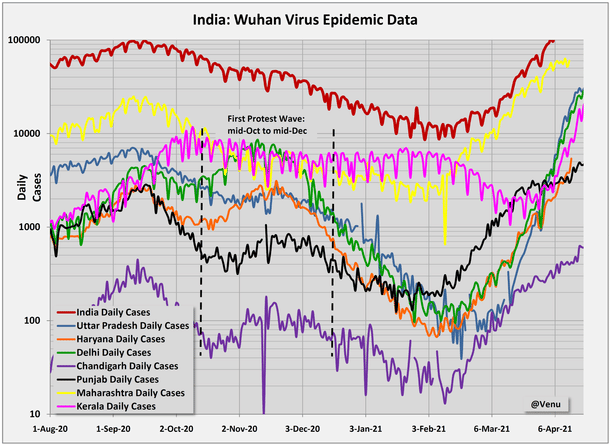
It can be seen from the chart above that the pink Kerala daily cases curve followed its own trajectory, independently, and in fact, declined between February and March 2021 before finally joining the second wave only in late-March.
Similarly, the Maharashtra curve (yellow), declined slowly and consistently in a staggered manner from mid September 2020 to early February 2021, before rising with the second wave.
And finally, there is a concluding, chilling edge to these observations and inferences:
Leave aside the fact that the farmers’ protest is a meaningless one, led less by farmers and more by middlemen; everyone warned that such irresponsible congregations would lead to a spurt in cases, that this was no time for agitations. But they didn’t listen, and went on to assemble in the many thousands, in frankly unsanitary settings, for months on end – first on the western borders of Delhi, and then on the east.
And now that done is done, the data is there for all to see – that the origins of the second wave lie in the heart of the so-called farmers’ agitation, from early January 2021 onwards, in Chandigarh, where non-resident Indians arrived in droves from the United Kingdom, in selected districts of the Punjab and Haryana, and even in Delhi, once the carnage of the Republic Day riots had been effected.
If not anyone else, hopefully, at least the courts may take cognisance of the empirical evidence presented, to thwart the genesis of a third wave, and prevent further risks to public health by such senseless protests.
All data from Covid19india.org
Venu Gopal Narayanan is an independent upstream petroleum consultant who focuses on energy, geopolitics, current affairs and electoral arithmetic. He tweets at @ideorogue.

